In 2013, my companion wrote a novel about medieval music and audio senses, De Auditu. Originally distributed exclusively on the web, we felt like we should sell it and rule the world thanks to the insane amount of profit it would generate. As a result, I offered to handle the whole editing process. If you can read French and are interested, it's now available on Amazon.fr in e-book or paperback.
This article is about the editing process and software stack used; text processing, output file formats, cover design and artwork will be the main topics. It will not enter into the details of novel writing, entrepreneurship, administrative and legal areas as I didn't handle these parts at all.
Keep in mind this is definitely not a cookbook on "the best practices at self-editing" but more a bunch of Do-It-Yourself example bricks to help you achieve a similar result. I'm interested in improving this current workflow for the next books, so suggestions are welcome.
Requirements
Let's start with the general requirements:
- Printable on paper with professional quality; we're not going to rely on LibreOffice for getting a printable format and layout.
- E-book format; because it would be a waste to avoid that (maybe relatively small) market.
- Digital illustration for the cover; I actually wanted to learn digital painting to deliver original content.
- Automated process; manually handling the whole file generation pipeline is bound to fail more than often, so going from the sources (text and images) to their final forms (covers, paper printable document, e-book) should never require more than running a command-line program or script.
- FLOSS stack; in case this was not obvious, I'm not going to work with anything else.
Choosing the text engine
Before starting any text editing, it was essential to find a common language for the different output targets.
No one will seriously consider something else than LaTeX for the PDF (and thus
paper) output, but at the same time I needed at least one e-book file format
output. Picking EPUB as the de-facto "standard" for e-books meant the source
language for this one had to be HTML (an EPUB is just a zip with a bunch of
HTML, CSS and image files). Unfortunately, the gateways between LaTeX and HTML
are limited and not reliable. And ideally, I'd rather not choose between a
nonhuman readable syntax and a flowerpot for editing a book. One
last requirement was that it also had to be a raw format in order to transcend
time and be processed with all kind of tools; vim, grep, sed and git are
not my enemies.
As a result, I decided to pick Pandoc, "a universal document converter" as they say, and use a Markdown flavor as common ground.
I also made little use of sed for pre-processing a markdown source file: the
information page needs different ISBN depending on the output.
Graphic stack
With regards to graphics, we wanted to make our own illustrations and covers.
Our graphic tools stack is composed as following:
- Krita, a gem for digital painting. That's what I used to draw the cover illustration.
- Inkscape, selected for designing the folding cover; the vector oriented model and its text manipulation were handy for this task. We also use it with Lan to design the Lapin Matin logo.
- ImageMagick, for the remaining image processing (scaling and format conversion).
All these tools have some command line controls, so that was also perfectly fitting our automation requirements.
I could probably have used GIMP since I knew it best, but the selected tools seemed to be much more appropriate for the task this time. If we were looking into designing the cover illustration instead of painting it, the photo retouching capabilities of GIMP might have been a better choice.
Industrialization
GNU/Make is perfect for orchestrating an automated process. It's especially appropriate since we are dealing with a relatively long chain of steps. Here is our typical pipeline (simplified):
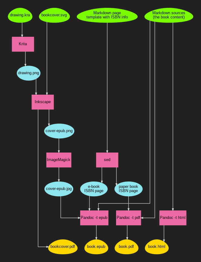
The green root eggs represent our source files, the pink rectangles the tools, the blue elliptic nodes intermediate files, and the yellow eggs the final targets.
Picking a dependency-oriented tool like GNU/Make makes it possible to trigger the regeneration of all the files in the tree branch without risk for an oversight in the process, or re-doing everything when modifying an element close to a leaf.
You can have a look at the Makefile if you're interested. I'm not using any fancy feature, so it should be understandable if you know the basics. You'll probably have to strip it a little for your use case, adjust some paths, and maybe reorganize it in a less chaotic way.
Beware though if you're planning on rewriting it from scratch; don't make the
same idiotic mistake I did: double-check your markdown source file order.
Either explicit the list, or use a sorting function. Using *.mkd as sources
is not enough to guarantee an alphanumerical order since it's
filesystem-dependent. We didn't even realize it before uploading our first
version. "Fortunately", no one was buying it so we had time to re-upload a new
version before any damage was done. Yeah, that's a very stupid mistake.
Text editing
The Pandoc website has a good startup guide for creating an e-book. That's not sufficient for a real book, so I'll describe here most of the obstacles I had to overcome.
All the following Pandoc examples will assume the use of the --smart and
--number-sections options. --smart is important in the case of a book to
respect typography. You probably want --number-sections to have a "Chapter
N" header inserted at every chapter, pretty standard for a novel. See the
pandoc(1) manual for more information.
For the metadata.yaml file (typically the first source file to pass to
pandoc), I didn't specify much information:
---
title: De Auditu
author: Lan Gyalsen
rights: © 2017 Lan Gyalsen
lang: fr-FR
...
Markup
The Markdown markup is simple, but does not give that much control. One of the most annoying limitation is dealing with non-chaptered pages. Books, and novels in particular, often start with various notes about the author, the book itself, or simply a standalone page with a quote.
With --number-sections, Pandoc will increment the chapter count at every new
header, so when you want a non-chapter you can use {-} as suffix to the
title to keep it out.
Sometimes, you don't actually want a title but a new page with untitled
content. For this I used # {-}, but that's not ideal as it gets indexed in
the table of contents as an empty chapter... This is the main reason there is
no table of contents in De Auditu.
# À propos de l'auteur {-}

Lan Gyalsen, après un cursus musical l'ayant menée à la rencontre de ce que
l'on appelle la «\ musique ancienne\ », s'est tournée vers les sciences
humaines, et est désormais professeur de philosophie.

...

# {-}

*«\ La grammaire des êtres, c'est leur exégèse. Et le langage qu'ils
parlent ne raconte rien d'autre que la syntaxe qui les lie. La nature des
choses, leur coexistence, l'enchaînement qui les attache et par quoi elles
communiquent, n'est pas différent de leur ressemblance. Et celle-ci
n'apparaît que dans le réseau des signes qui, d'un bout à l'autre, parcourt
le monde.\ »*

...

# Chasse

> «\ Champs ont yeulx, et bois ont oreillez.\ » \
> Saint Bernard, *Renard le contrefait*, IV, 27466

Jehul se décida finalement à faire s'arrêter sa monture et, prenant d'une
seule main le cuir échauffé des rênes, il passa l'autre sur son front pour
éponger la sueur qui y coulait lentement

...
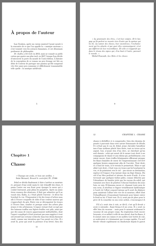
The above example of chaptering results in this:
You may notice the escaping of random spaces in the Markdown. This is for
unbreakable spaces in French typography; you need them to prevent awkward line
breaks. Adding them everywhere was part of the editing chores. It was important
to review in detail if all the typographical rules were honored: learning the
different usages of -, -- and --- was part of the experience (dialogues
are a real pain in French typography...).
The quotes were also hard to handle. Typically, I had to force line breaks with the trailing backslash in the context of a block quote. Style control was also tricky depending on the output, so the current result is not exactly ideal.
LaTeX/PDF output
Amazon's enforced book dimensions are all kind of large. We picked (one of?)
the smallest one: 5x8 inches (12.7x20.32 cm). It's much larger than the
pocket formats we can find in libraries, but that's the way it is.
On the command line, this meant using -V geometry:paperwidth=5in and -V geometry:paperheight=8in. I also picked the memoir document class because I
liked better how it handled page numbering (typically with book, blank pages
have their page numbers visible in the top left, it's grotesque).
While the cover is not part of the PDF (you have to deal with it separately), you may still need to insert images. In our case, we wanted to insert our own editor's logo in one of the entry pages along with some information about the book. Unfortunately, dealing with images was a real pain.
As soon as you include one in a memoir document, the output dimensions get
completely messed up. The workaround was to transmit
\setstocksize{8in}{5in} to LaTeX using -V header-includes.
Also, since we are dealing with a novel, we do not want the default "Figure X:
..." captioning system. Using the same header-includes variable, it's
possible to insert \usepackage{caption}\captionsetup{labelformat=empty} in
order to adjust the package behavior.
In the end, the pandoc call in my Makefile looks like this:
$(PDF): $(SRC)
	$(PANDOC) \
		-V geometry:paperwidth=5in \
		-V geometry:paperheight=8in \
		-V documentclass=memoir \
		-V header-includes="\\usepackage{caption}\\captionsetup{labelformat=empty}\\setstocksize{8in}{5in}" \
		$(SRC) -o $@
E-book output
LaTeX sucks, but EPUB is a few orders of magnitude worse. Do not ever expect to have the same output on two different devices. E-book readers in 2017 are like Web browsers in 1998, except that you have tons of devices and apps to deal with, each of them trying its best to be worse than the others.
You'd expect the basic stuff like the cover image to be a pretty standard thing
in such a format. Don't make me laugh, it's a freaking <img> tag, scaled
randomly by the readers, with no single standard size.
So let's put it simply one more time: e-book readers will tear apart and destroy whatever layout style you ever think of, so you have to keep it as simple as possible to limit collateral damage. Even with low expectations, you will be disappointed.
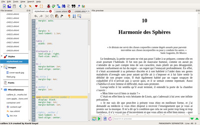
After all these warnings, you will nevertheless need to customize the CSS a bit. I recommend relying on Calibre to live edit the CSS. It will also help you find out the class names used by Pandoc. It's also a good way of getting a preview of the e-book.
There is not much to say about this, so I'll just share a few settings of De Auditu's CSS:
/* mitigate braindead handling of covers in readers */
div#cover-image img {
    width: 100%;
    margin: auto;
}

/* indent paragraphs to follow French typography */
p {
   margin: 0;
   text-indent: 1.5em;
}

/* split the chapter number from the chapter title */
span.header-section-number {
    display: block;
    margin-top: 1em;
    margin-bottom: 1em;
}

/* prettify rights/author page */
p.author {
    margin: 1em;
}
.rights, .author {
    text-indent: 0;
    text-align: center;
}

/* create a custom quote class to deal with the standalone opening quote */
span.quotesrc {
    display: block;
    text-align: right;
    margin-top: 1.5em;
}

/* customize how the pictures and their captions are displayed */
div.figure {
    margin-left: auto;
    margin-right: auto;
    margin-bottom: 3em;
    text-align: center;
    font-style: italic;
}
Needless to say you should probably not copy/paste that as-is, but it will
provide hints on how to deal with various layout issues. The most useful trick
in the above sample is probably the header-section-number thing. You may want
to go further by forcing extra content such as "Chapter" (but that won't work
for many devices).
The pandoc call in the Makefile for the EPUB output looks like this:
$(EPUB): $(SRC) cover-epub.jpg
	$(PANDOC) \
		--epub-stylesheet=style.css \
		--epub-cover-image=cover-epub.jpg \
		$(SRC) -o $@
Artwork
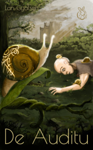
Surprisingly, the artwork part is what I'm the most satisfied with. I could have chosen a simpler path, but the end result was in my opinion worth it.
Before I start diving into the illustration work, I'll share one important lesson with you: do not start your painting before knowing its exact dimensions. It will influence your composition, and more importantly it will save you a lot of time since you won't have to scale, crop, or extend the drawing in the future like I had to...
Since we picked Amazon as our main distributor, the paperback cover
documentation was a must read. Assuming a 5x8 inches
book dimension, with an extra 0.125 inches bleed on the right, top, and
bottom, the picked resolution for the drawing was 2200x3541 (including
painted "dead zones"). Don't make the same mistake as I did, do the math!
Painting an illustration
I don't have any formal artistic education, except maybe drawing as a child and some daily doodling exercise I've been doing a while ago. My main issue has always been obtaining a (semi) pro result, especially with regards to coloration.
The original draft of the cover was made with pencils, but coloring was a real issue for me. I tried all kinds of tools and the results have all been disappointing. Fortunately, around that time I came across David Revoy's work. Working on Linux using exclusively open-source software, he is documenting the complex professional process he's following, often in the context of drawing Pepper & Carrot.
The making of episode 22, an article about digital coloring starting from a pencil sketch, gave me hope. So I played with that, blue pencil, scanner, blue filter, G'MIC smart coloring (this plugin is insanely good, great work from him). It was extremely interesting but I was still in a dead end. The filling paint tools could have been enough for a classic comic coloring, but it was not adequate for the rendering I was looking for.
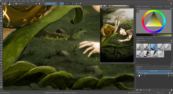
So I bought a standard graphical tablet; Wacom Intuos Art Medium for about 140€ (currently at 180€ on Amazon so I guess it was a good deal at that time) and started watching his A to Z comic page tutorial with Krita while waiting for the delivery. It was one of the greatest introduction to Krita for me.
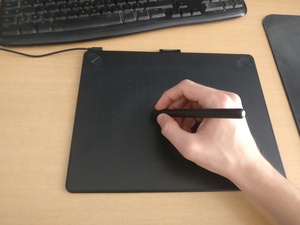
Plug & play, the tablet was working out of the box on Linux without anything to configure or customize. I then followed David's comic page process, somehow simplified:
- Sketching with the pencil brush
- First layer with gray scales only, using the
block_fuzzybrush; lovely approach I must say, especially when you know that e-ink is black and white, so it's better for a sane consistent lightning of your illustration - Automatic pre-coloring with filters
- Coloring with the
FX_color_HSYbrush - Re-painting and adjusting with
block_fuzzybecause I was too bad to make it look nice at first - Post production with miscellaneous brushes (glow, noise, ...)
I skipped a few steps such as the outline since I didn't want a comic style, as
well as some of the filter steps. All of this may look like I'm following a
strict methodology, but in the end, I did a lot of rework on top using mainly a
default block_fuzzy brush to stack layers and layers of happy accidents.
My view on digital painting is that it really is all about crafting noise by
accumulating fuzzy layers. Contrary to real painting, you can accumulate
infinitely without deteriorating the surface, and cover any previous
mistake accident. I'll end this section by giving a few tips not
mentioned in the previously linked video that helped me a lot while learning
Krita:
- In windows mode,
View→New view→<the drawing>, left click on the window →Stay on top. It gives an overview of the current drawing while being zoomed in on the main view (which means, almost always with high resolution drawings). kandlkeys to respectively darken and lighten a color: it's probably the keys I used the most during the grayscale coloring step.- Rotate with
Shift+Space, and5to reset. - The
Temporarily Save Tweaks to Presetcheckbox in the brush parameters: extremely useful during the sketching step since the eraser (ekey) of the pencil brush is way too small, so instead I was always switching to another brush. Unfortunately, selecting the pencil back after some erasing was resetting its size.
Krita really is an incredible software, it's my best software surprise this year.
Crafting a cover
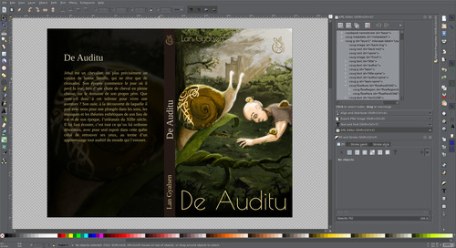
Inkscape can be a real pain to use sometimes. However, when the time to design the paper book cover came, my body was not ready to deal with the bookcover LaTeX package. Don't get me wrong, it probably does the trick, but a wise man once said: "LaTeX does text rendering well, but for everything else it is like asking a concrete block to compose classical music". In the case of a book cover, the only text area to deal with is the teaser on the back, so Inkscape is pretty much fine.
The first thing to do in Inkscape is to set up the document properties
(Ctrl+Shift+D) so that it matches the book dimensions. In my case, the spine
with 192 pages means a width of 192x0.0025 = 0.48 inches. Given the 5x8
inches book dimensions and 0.125 inches bleed, the final document has a width
of (5+0.125)x2+0.48 = 10.73 inches and a height of 8+0.125x2 = 8.25 inches.
These imperial units are dumb but fortunately Inkscape supports them.
When inserting images, it's essential to insert them as Link instead of
Embed (the image import popup will ask you). The reason is obvious: in our
automatized workflow we always want Inkscape to re-generate the cover based on
the latest version of the drawing without modifying the .svg.
You should also use and abuse the alignment helpers (Shift+Ctrl+A) to get a
clean and pixel-perfect organization.
The usage I made of Inkscape was basic, except maybe for one key thing: object
naming. If you plan to use that document to generate both the e-book cover and
the paper book one, you will need to identify the front area in order to export
only that part for the e-book. For this, you can use the XML Editor
(Ctrl+Shift+X).
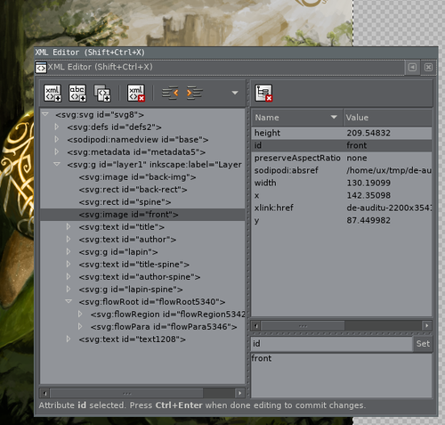
This tool is also useful to identify each object and make sure you don't have
invisible crap all around. It happens quite often with Inkscape: if you create
a 0% opacity object, you won't be able to select it again, yet it will still be
there... Similarly, moving a smaller object behind a larger one (using Page Up and Page Down) will also prevent you from selecting it again. The XML
editor is useful in this situation.
Note: you can also use the object properties to set its ID, you do not need the XML editor if you only need the naming option.
In order to export only the area where the object id front is located in a
PNG with a width of maximum 800 pixels, you can use something like inkscape -i front -w 800 -e cover-front.png bookcover.svg. Inkscape also supports the PDF
output, which is what Amazon wants for the full book cover: inkscape -d 300 -A bookcover.pdf bookcover.svg for a 300 DPI PDF output using the same SVG
source.
Closing words
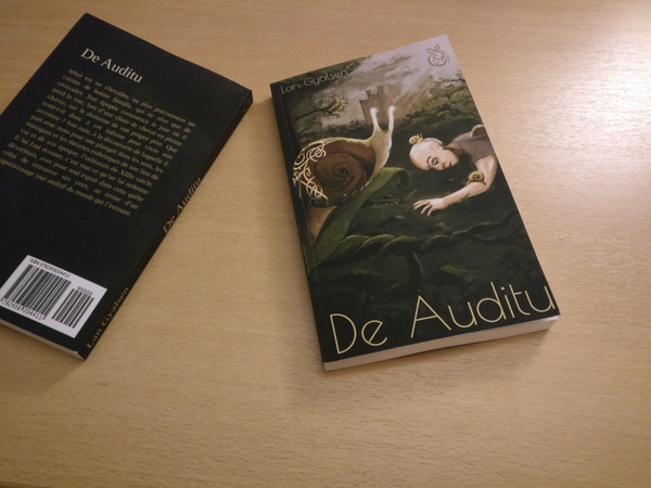
The paperback cover got darker than what we expected. Typically, the background on the back appears almost completely black. Aside from this, the printed book looks fine despite a few warnings from Amazon's preview app related to the footnotes. We may also have wanted a slightly larger inside margin for the text, but that's nitpicking.
Reproducing the workflow of an old and large industry, learning various advanced topics, finally satisfying my frustration with regard to the digital colorization and painting process, and assisting the release of an artwork in the real wild world has been exceptionally gratifying. As usual, it's been time consuming, but hey, we have to keep ourselves busy until death.